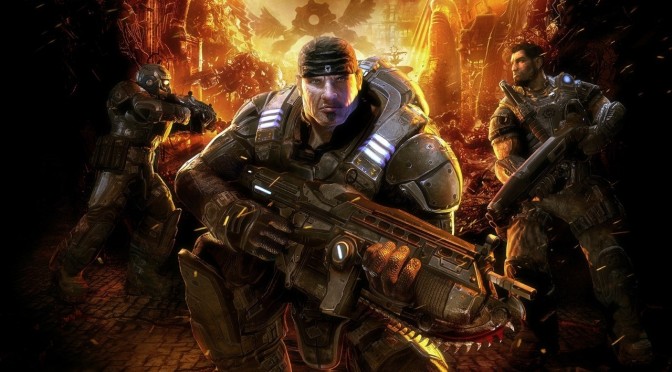
YouTube’s ‘frost Danger’ has released a new video that compares the cutscenes between the Original and the Ultimate Edition of Gears of War. The first Gears of War was powered by Unreal Engine 3, while this new Ultimate version is powered by Unreal Engine 4. Enjoy the video after the jump!

John is the founder and Editor in Chief at DSOGaming. He is a PC gaming fan and highly supports the modding and indie communities. Before creating DSOGaming, John worked on numerous gaming websites. While he is a die-hard PC gamer, his gaming roots can be found on consoles. John loved – and still does – the 16-bit consoles, and considers SNES to be one of the best consoles. Still, the PC platform won him over consoles. That was mainly due to 3DFX and its iconic dedicated 3D accelerator graphics card, Voodoo 2. John has also written a higher degree thesis on the “The Evolution of PC graphics cards.”
Contact: Email
Looks nice though everything is brown.
Times like these i can get behind Sweetfx oversaturation.
Unless it’s some of your hidden messages (I’ve yet to find any :/ ). there’s a mistake on the text John (Unreal 4 twice).
OT: Yeah, Yeah, GFX and all, what I really want to see it’s proper PC support this time around.
Get on it M$, and I may even pick this up.
Maybe. 😛
what happened to the blue?
Lookin good. 🙂
The graphics are way better (models, textures, effects, etc), and so is the camera work and cinematography. The only thing I don’t like is how drab and low-contrast everything is. Everything is dull and brown and uninteresting looking.
am i blind or something? i cant see that much of a difference, Cole’s face is really weird in both of them, the effects on the fire are better but in a lot of ways it doesnt look as good, maybe its just the colour filter, but this isnt a very good remaster at all.
Yes, you’re blind. Jesus,
i’ve watched it like 4 times, i think its just the colours, im sure sweetfx will fix it.
I like the old characters better, they just look more badass. everyone looks too clean in the new version
triple post… sorry
Where’s the color, where’s all of the facial scars and details, where’s the ambient occlusion? All of the character from the original is gone and replaced with a crap brown color palette. Why? Aside from resolution, I think the new one looks like crap.
EDIT: Whoa, why the triple post? My tablet must have freaked out.
The characters look more detailed and they all retain their “facial scars” except for the black guy. His face looks a lot smoother.