
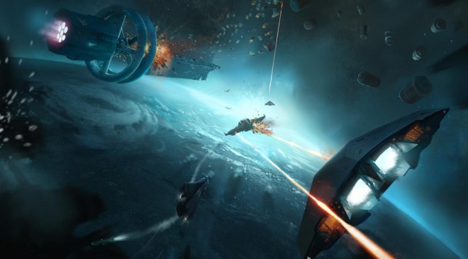
Following Next Car Game: Wreckfest’s case, here is another game for which gamers claimed that the developers downgraded its visuals. A couple of days ago, some owners of Elite: Dangerous provided a number of screenshots to showcase the graphical differences between the previous and the latest versions.
PC gamers reported that Dust/Fog has been greatly reduced, the Galaxy Map has changed, some textures got worse, and that both the Ring LOD and Station Letterbox Draw Distance were reduced.
Frontier replied to those claims and shed some light on what exactly is going on, and whether the PC version was downgraded due to the upcoming Xbox One release.
As Greg Ryder, Frontier’s Head of Rendering, said, the team is not inclined to downgrade the appearance of anything in the game, and that the Dust/Fog system was optimised due to a pathological case of overdraw, thus some systems may look a bit worse than before.
“Please thank Granite for putting together a thread like this. The team is always striving to make things better, and we’ve found a number of things using the profiling tools on the Mac and Xbox One that have improved the PC build (thus the opposite to the fear they might lower the quality of the PC build). Elite: Dangerous is built to scale on PC (including 16k screenshot ability and hopefully one day 16k game when the monitors & graphics cards exist!). We are certainly not inclined to downgrade the appearance of anything in the game. Exposing more tweakables for an enhanced Ultra is clearly something you guys are passionate about and we’ll see where it can fit in the current roadmap.
On the ships / galaxy map front, I’m not aware of any changes that went in for 1.3.
Dust / Fog: This was optimised due to a pathological case of overdraw (which looked very broken in a number of cases). There’s definitely no downgrade due to our Mac and Xbox One versions, but there have been some changes. Performance and visual consistency should be improved in the general case, however it does seem that some systems are not looking as good as they did. As ever there is no perfect solution. For a fair comparison, the exact same position and lighting conditions are needed (some viewing angles will always looks more awesome!), but we could have entire threads dedicated to discussions on how to light rings (and we’ve had many long discussions internally). I have a number of open issues in our system on the look of the rings, though currently no ETA for when we’ll be addressing them.”

John is the founder and Editor in Chief at DSOGaming. He is a PC gaming fan and highly supports the modding and indie communities. Before creating DSOGaming, John worked on numerous gaming websites. While he is a die-hard PC gamer, his gaming roots can be found on consoles. John loved – and still does – the 16-bit consoles, and considers SNES to be one of the best consoles. Still, the PC platform won him over consoles. That was mainly due to 3DFX and its iconic dedicated 3D accelerator graphics card, Voodoo 2. John has also written a higher degree thesis on the “The Evolution of PC graphics cards.”
Contact: Email