This Comparison Proves That DOOM Would Look Better With Proper Colours

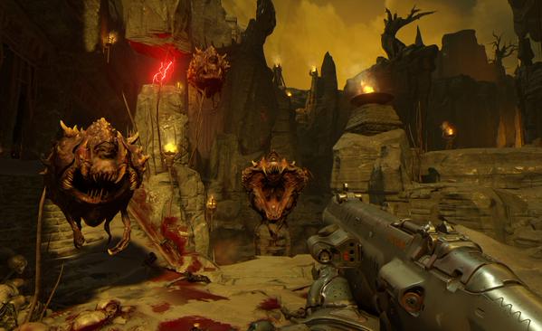
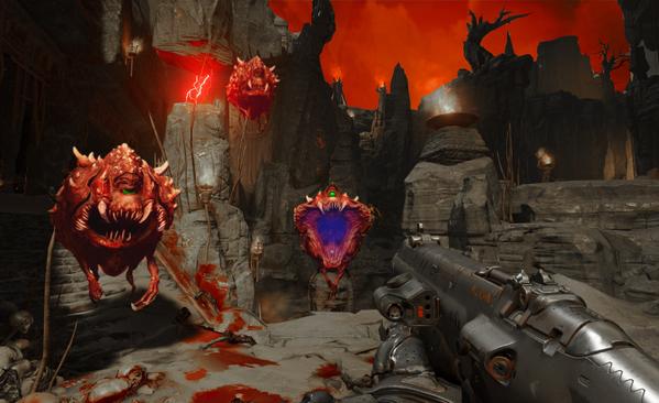
When Bethesda revealed Doom to the public, one thing made everyone scratching their heads; where the hell have the colours gone? It appears that id Software has included a brown-ish filter that may very well annoy you. And if the following comparison is anything to go by – created by NATHAN RANNEY – then we can safely say that the game would look better with more proper colours (I mean, the Cacodemon is red. Plain and simple. Not brown). Here is hoping that id Software will give players a way to remove this filter from the final game.

CHjbF_TUEAEN9rJCHjbFwRVEAAo1P5

40 thoughts on “This Comparison Proves That DOOM Would Look Better With Proper Colours”

  1. The ‘browness” of the first screenshot reminds me of Unreal Engine 3, where every game using it was either completely brown or grey.

  2. The bottom screen looks weird since nothing on the ground has a red tint from being illuminated by the sky. Which does look similar to some of the hell levels in the original game, but in that case it was probably due to an engine limitation.

    1. Yes! Thank you. In the light of day the real world actually does have a bluish tint because of the blue sky. The yellow tint is no doubt from a yellow sky. If you
      make the sky blood-red then the whole world would have a red tint, which
      wouldn’t look ‘realistic’ to us, either. A red sky and white lighting on the rocks/ gun definitely looks artificial.

  3. This does look much better. Cacodemons should be red, or at the very least they should look like Anita Sarkeesian. Hopefully he’ll make a mod.

  4. Cacodemons were grey in Doom 3 . It was doom 1 doom 2 final doom and doom 64 where they were red.

  5. Yes it does look better, all through the presentation I felt that the enemy design didn’t lend itself well to picking out the different types of demons, did kind of put me off, we need more visual distinctiveness in a game like doom.

  6. Devs nowadays have forgotten the use of contrasting colors, everything now needs to be “realistic”, washed out, moody
    Which isn’t to say it isn’t good, but when we look back at the somewhat realistic games in contrast (heh) with the more colourful ones we can see who age better.

  7. It’s just typical sweetfx syndrome. Blow everything out with crazy saturation, no matter the game or the setting. Skyrim? Give it the lighting of a tropical resort. Splinter Cell, Dishonored? Crushed blacks in a freaking stealth game so you can’t even see what you’re doing anymore. The worst thing is people don’t even use calibrated monitors to come up with the settings so most of the time they are compensating for deficiencies in their own hardware.

    1. I noticed this big time with Witcher 3 SweetFX profiles. I haven’t found a single one that makes the game look better, only worse.

      1. It’s going to depend a bit on monitor calibration, and in-game conditions, especially regarding lighting. Witcher 3 doesn’t have the greatest lighting, so it’s a bit difficult to work with.

        For the most part though, SweetFX/ReShade presets are made and advertised by people who aren’t very good at what they’re doing, don’t know how to put a subtle, or corrective touch on things, and usually just go for the obvious, stark differences.

        There are some great presets, but they won’t always serve every monitor etc. well, and they’re relatively uncommon because there are very few people actually take the time to pay attention to the more subtle touches.

      2. There shouldn’t be a need for SweetFX in the first place. Saturation, hue, brightness, contrast, gamma, sharpness etc should all be present as sliders in the options menu of every game.

        The fact that this praxis isn’t industry standard and only happens on rare occasions is really disappointing to the point of being enraging.

  8. don’t be color racist white boy:) nothing is wrong with yellow, personally I think in this scene the original is more believable and the white one looks artificial(and ugly…).

    1. Sh*t smeared filter with no color = belivable and not artificial.

      Sure thing, bet you loved the green and blue tint from Fallout 3 and Battlefield 3 as well.

  9. Imagine scientists taking pictures on Venus, one of them comments: Damn guys that yellow-piss filter makes it look so not cool…

  10. TBH it doesn’t look that good on either version, the game is just not that impressive in terms of graphics compared to other top graphics fps these days, even in terms of art direction.

      1. In the original Doom the demons do not drop candies (ammo and health) when killed, like piñatas.

  11. This doesn’t even “feel” like Doom, where is the scary corners? lightning? dark world? All I saw is the main guy dodging monsters like Goku, dashing left and right and COD style gameplay.. Doom is about suspense scary moments .. this had none of that..

    1. What are you talking about? With the exception of Doom 3, Doom was practically an arcade shooter. This feels much more in the spirit of Doom and Doom 2.

  12. Yeah. From I remember this blody colour,Brown,was from 2006-2008 when I saw in NFS MW,GTA IV etc?
    Ugly colour show us in games.If you wanna change it use SweetFX.Do it.

  13. The colors didn’t bother me – what *did* bother me was how everything was so well lit. One of the things that made Doom 3 so great is its lighting and shadows – nothing is more scary than a monster than suddenly falls into shadow and you can no longer see it!

    This new doom doesn’t look scary. It looks like a mindless corridor shooter with brightly lit hallways. The gameplay is spot-on, though – it’s the kind of mindless killing I want, but there is *definitely* something very wrong with the lighting and atmosphere in this preview.

  14. Dude, it really depends. In some cases you need different lighting(filters), in some cases not.
    The filters seem to blend things together, and create a more balanced scene in terms of colors. Without the filter it is shocking how very out of place things look, where the artists didn’t have the time to fine tune the colors. So all in all, ideally you would create a game where all the assets together do not make you vomit, but that requires a lot of development time. Cutting down on costs you can apply filters to bring things together…

Leave a Reply

Your email address will not be published. Required fields are marked *