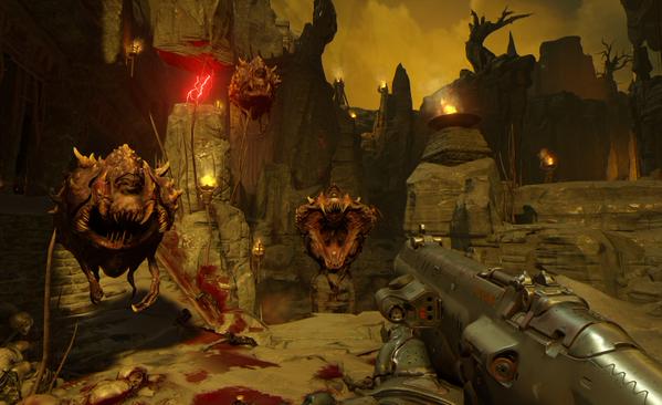
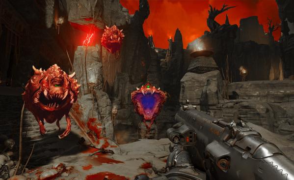
When Bethesda revealed Doom to the public, one thing made everyone scratching their heads; where the hell have the colours gone? It appears that id Software has included a brown-ish filter that may very well annoy you. And if the following comparison is anything to go by – created by NATHAN RANNEY – then we can safely say that the game would look better with more proper colours (I mean, the Cacodemon is red. Plain and simple. Not brown). Here is hoping that id Software will give players a way to remove this filter from the final game.
John is the founder and Editor in Chief at DSOGaming. He is a PC gaming fan and highly supports the modding and indie communities. Before creating DSOGaming, John worked on numerous gaming websites. While he is a die-hard PC gamer, his gaming roots can be found on consoles. John loved – and still does – the 16-bit consoles, and considers SNES to be one of the best consoles. Still, the PC platform won him over consoles. That was mainly due to 3DFX and its iconic dedicated 3D accelerator graphics card, Voodoo 2. John has also written a higher degree thesis on the “The Evolution of PC graphics cards.”
Contact: Email


